I love meeting new people but there’s a conversation that I sometimes dread. You know the one, the, “What do you do?” conversation.
Don’t get me wrong. I love what I do and I really enjoy talking about my work. However, every once in a while the conversation takes a turn and leads into something like,
“Ohhhh, do you make those courses people ~have to~ take?”
My immediate reaction is to shake my head. A brief moment of embarrassment hits me like a ton of bricks. I never really get over it.
When I first started creating elearning, I had no idea what I was doing. Absolutely.no.idea. I copied what I had seen in other elearning courses. That may have been my biggest downfall. The critiques I got from the community were all so positive. Were people afraid to tell me the truth? I don’t really know, maybe that’s a conversation for another time.
I wasted a lot of time being a bad designer and nobody tried to stop me.
That being said, I have come a long way in the past few years. I don’t always create really great and usable designs. However, I’ve learned how to ask for and apply feedback and where to look to build my skills.
I cringe when I look at a lot of my past work. I do feel proud of my progress too. I have some major pet peeves now based on some of the work I did. And, I also have to take some of those really bad courses, so of course my list of pet peeves continues to grow.
Here are just a few of my personal pet peeves, in no particular order.
Use of characters when they add no value and are a distraction
This is a screenshot from the first course I ever created outside of grad school. Welcome to my 2012 blunder. I wanted to create a course in Captivate that taught people about the features of Captivate. I bet I thought I was being super meta. Why is Professor Mary here? What does she have to do with Captivate? The world may never know.
Random non-helpful characters in elearning really irk me. There's a fine line between characters supporting your design and becoming really cliche and in the way. Have a clear purpose for your characters. I only add characters when users choose a profile character in a gamified situation, a character is a key component in a scenario or activity, or (in very few cases) as someone who helps you walk through a task (this can be handled super poorly, so I caution against it). For the love of all that is holy, please do not just place characters in your learning to introduce topics.

A weird mixture of vectors and stock photos
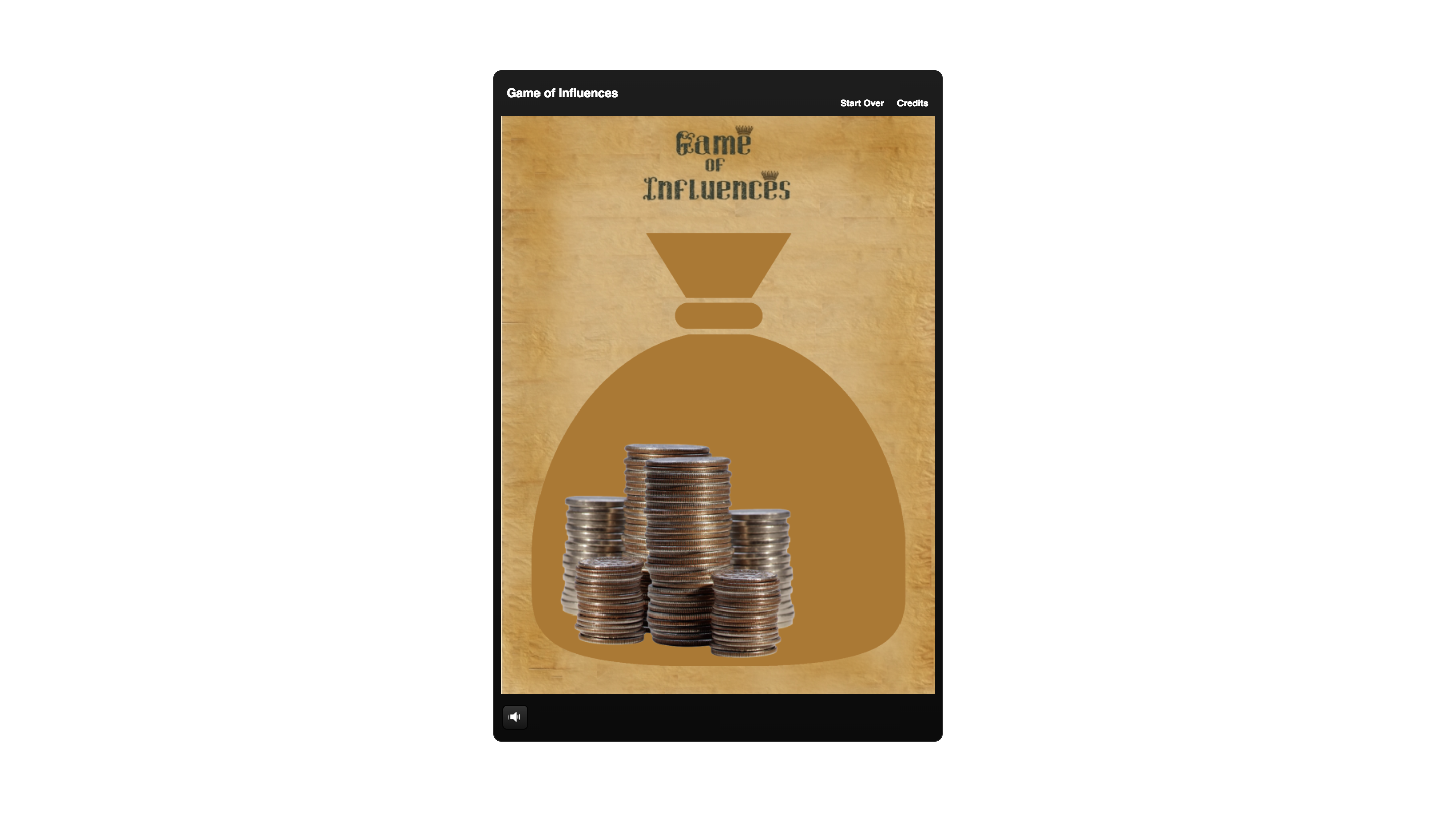
Mary and my Captivate mishap also violate the rule of tastefully mixing vector and stock images. It just looks really bizarre and like the design doesn't fit. I really try to avoid mixing the two unless I know I can pull it off. I violated this rule many times. Enter stage left, one of my first Storyline examples, a Game of Thrones inspired multimedia massacre. Gross. 🤢
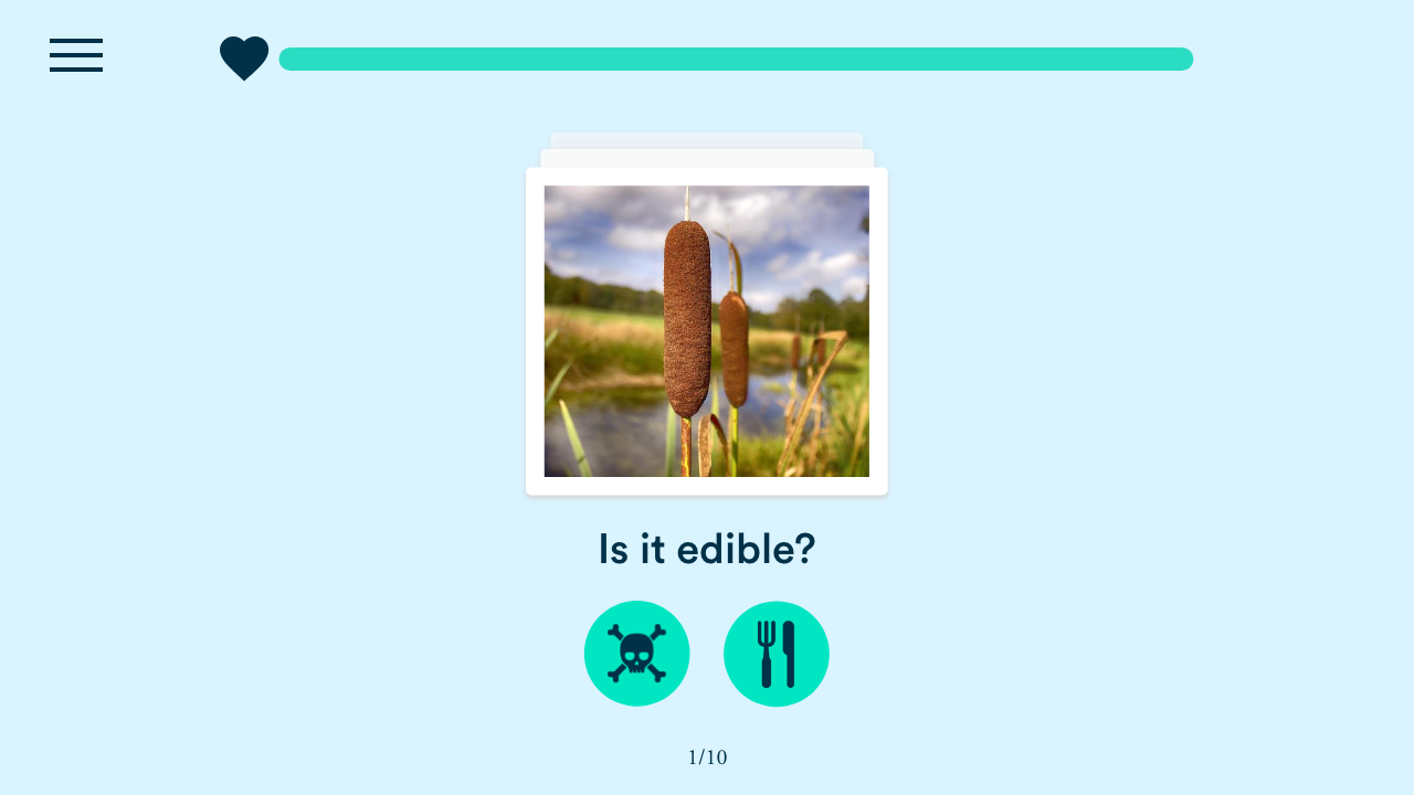
Instead of trying to make vector and stock work, stick to keeping them more separated on a project. I'll use photos where needed and then if I use anything vector it is typically in the form of icons. A good example of this is in an activity I am working on to help users identify edible plants. I have both icons and images but I keep them separate. Simple can be beautiful and usable.
Really long or overly complex navigation
Really long or super complex navigation is probably one of the most common occurences of elearning disasters that I see. It causes a lot of confusion for our users and me.
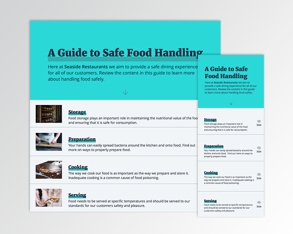
For a project two years ago, I created a classic, yet more minimalist example of out of control navigation. Even though the menu is tame, it's confusing to give the user duplicate navigation at once. Whenever you can, keep it simple. This one is also an offender of the character for no reason rule. I see you Mary 2.0. 👀

For my project I had decided to revamp the confusing menu to a more modern and responsive look and feel.
Traditional Next/Back buttons or player
Using default settings on elearning software is not okay. It just is not. It screams,"I didn't have time to invest in designing your learning experience, so let's just plop everything in as fast as we can." I guess that's okay for compliance training, right? I wouldn't advocate for it, regardless.
I know that people ~don't always~ have time to design experiences but if it's an experience. However, if you truly want people to learn and apply what they have learned from your content, then you need to think about how you design and how users use your content to solve problems. Are the default settings really going to allow them to do that? Don't jump to excuses, think about it for a minute. Be an advocate for your users.
Typing into a text field for no real reason other than reflection
Or any activity that I have to do but I have no idea why or what the outcome is. I'm totally guilty of adding meaningless activities to my elearning courses. Do I do it anymore? No, because it's a waste of everyone's time. I've taken courses where I have typed in answers and they've been graded by peers and that's perfectly fine. However, I have also had experiences where I have been forced to type in a reflection. To this day, I have no idea if anyone ever got my response or what it really meant for me.
Unnecessary voice overs
Now I must wait to advance to the next portion of this training because someone must read a slide to me out loud. No, just no. Voice overs are great in video but do they really need to be added to elearning every single time? Ask yourself, Is it necessary? What value will it serve the user?
On screen instructions
I will forever feel guilt and shame for writing on screen instructions in my elearning. I still catch myself ~almost~ designing it into my elearning. I recently read a post about how you can combat this, it's worth a read. I made this error in that first Storyline activity I made.
Things you are supposed to click on but they don't look clickable
I am still the biggest offender of this one. Making things look clickable in elearning is very hard. I've started to use animation to draw the eye to certain clickable items. This is something I will continue to work on, no excuses!
Locking down or gating a course
For me, locking down a course so a user cannot proceed is the absolute worst experience of them ALL. I feel like we are telling adults that they are not to be trusted to follow an order or to figure things out. Good design will indicate an order to people and we need to trust them to own their learning. You don't see professors locking up half of their textbooks so students can't move on or companies like LinkedIn locking down videos their customers are watching.
The only place I see locked content online pertains to paid content or when marketers are trying to generate leads and need your email to unlock a paper. It's just a barrier and a bad experience.
Trying to make elearning work when it doesn't
This is just as bad as locking down learning. eLearning is not always the answer, nor should it be. People purchase elearning tools and suddenly building traditional elearning becomes the "end all be all". This is another huge disservice to our users. Let's think about when our users will use our tools and content and help to meet them where they are.
When it comes down to it we need to seek feedback on our work and produce the best designs we can for our users. We need to advocate for our users. I hope you enjoyed me lightly hating on some of my older projects and sharing my thoughts and experiences along the way.
— Mel